
Directed by Alex Proyas
VFX Supervisors/Producers: Mara Bryan, Arthur Windus, Andrew Mason
VFX Director: Bruce Hunt

Directed by Alex Proyas
VFX Supervisors/Producers: Mara Bryan, Arthur Windus, Andrew Mason
VFX Director: Bruce Hunt
Miniature Directors: Bruce Hunt, Andrew Mason
In this new creation by director Alex Proyas, who helmed the almost-cult film THE CROW, he has brought the visuals to a new level. The movie centers in the life, or maybe illusion, of John Murdock (Rufus Sewell), who by the way is wonderfully cast thanks to his retro silent-movie looks. The story is set in a world where the sun never rises, which sets the mood for the film's visual effects as well as set design. The production is amazing. DARK CITY is everything BATMAN should have been, and wasn't. The city is a terrific mixture of retro gothic-meets-art deco-meets your worst dark and lonely nightmares.
The wide shots of the city have been accomplished with mostly model photography. It is these wide vistas where, unfortunately, the movie lacks some punch. Most of the wide aerial and ground level shots have a out of scale and toyish look to them, especially where some of the city's trains and cars are visible. These shots are very reminiscent of Fritz Lang's METROPOLIS. But whereas in METROPOLIS you can forgive the amateur models, in DARK CITY those same models and views take a big toll in the believability of the shots. Another problem with the city shots is an almost complete lack of depth cueing, thus damaging even further the sensation of really "being there". The one aspect of the city views that saves the day is the superb lighting. The contrast in almost all the movie's miniature shots is very sharp, giving a very oppressive and retro look. Despite any mistakes in the city shots, it is still the best looking gothic city seen in the silver screen in a long time, probably since BRAZIL. Matte paintings also help in some shots of the city, accentuating the 40's mood, and giving a weathered and rusty look in shots where the miniatures couldn't quite accomplish the necessary atmosphere.
 Visual Effects Produced by:
DFILM SERVICES, Sydney
Creative Director: Peter Doyle
2D Supervisor: Jon Thum
Animation Supervisor: Sally Goldberg
Model/Miniature Supervisor: Tom Davies
Directors of Photography: Ross Emery, Michael Wood
Review by Aladino V. Debert
Contributing Writer
aladino@vfxhq.com
©1998 New Line Cinema 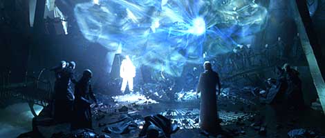 Murdock and the head Stranger begin their "tuning" duel, resulting in a dazzling display of light and warping effects. Below, the world around Murdock collapases as a new city block grows around him. At bottom, a distortion wave ripples from the center of the Strangers' machinery. 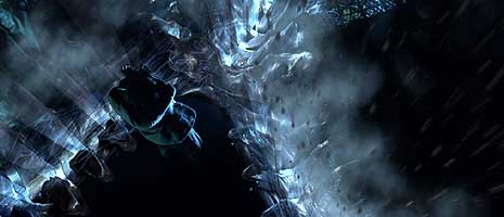 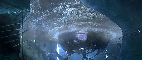 |
Also, "tuning" entails some nicely done "mind wave" effects. The rippling effect distorts everything it passes and it looks very realistic if such a thing is possible. The Strangers main headquarters, to give it a name, is wonderfully depressing. Accomplished mainly with miniature models and some set pieces nicely comped over, digitally extending the room's space and population. Again, these sequences feature set design and cinematography that are amazing and overwhelming. For the "tuning" shot that begins inside the headquarters, a mysterious and wonderous use of CG appears, in the shape of a huge machine that "grows" upward constantly changing shape. The CG elements, as for the majority of the movie, are very well integrated into the miniature plates. In another tuning shot, the "staircase growing" shot is especially well done, very realistic and seamless.
©1998 New Line Cinema 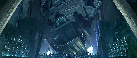 A trio of images from The Strangers' lair, hidden underneath the world of DARK CITY. Above, The Strangers begin their 'tuning' exercise, giving birth to new skyscrapers. The buildings, created as CG elements (while miniatures and splitscreen cloning make up the rest of the lair) twist and scale from a seemingly singular birthpoint in a mesmerizing display of power. Below, Hand rises from the depths of the lair. At bottom, Murdock gets into a "tuning" battle causing waves of power to blast his enemies away. 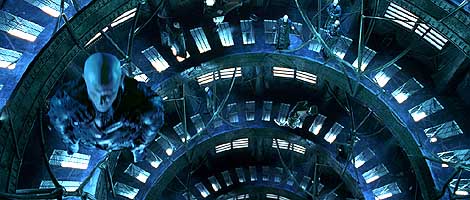 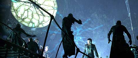 |
The ending destruction sequence is a good mix of again, model photography and CG animation. There's some wonderfully executed blasting mind waves and melting floors. The sequence works well also thanks to the fast paced nature on the editing. The eye is constantly drawn to different sections of the frame, therefore helping the overall effect. In this destruction sequences is where the most effective CG effect of the movie happens. It is an unfortunately very short shot of an expansion wave underwater, which was beautifully accomplished.
After the destruction scenes there are some more views of the city that don't quite work. There's an outer space shot of the city that is quite unfortunate. The miniature look is so blatantly obvious that it throws the whole effect out of whack. Although this is somehow helped by an interesting "sunrise" effect that comes afterwards, the city still looks unrealistic. There are also some stock shots of water that are used in a very poor way. They are edited together with views of the city that is supposed to be in outer space and nevertheless the stock footage has a "darkened" look to them, reminiscent of the night shots of the 40's and 50's movies before the advent of more sensitive film.
The last scene takes place on a deck by the newly formed ocean, where some inconistencies exist. The matte lines show a little too much and the color of the clouds in the background doesn't match the lighting on the actors faces.
Regardless of some poor decisions in the use of miniatures, the overall use of CG is very effective and the composites are extremely well achieved. DARK CITY is a great step towards creating a nightmarish look with a twist... and actually gets there.
Check out Cinefex 74.
Official Web Site: http://www.darkcity.com
DARK CITY Copyright ©1998 New Line Productions, Inc.

. . VFX HQ Produced by Todd Vaziri . . http://www.vfxhq.com . . e-mail: tvaziri@gmail.com . .
All text Copyright © 1998 Todd Vaziri, unless otherwise noted